Explore Topics
0%
How to Improve Your WordPress Website’s User Experience (UX)
Jan 17, 2026

Ever landed on a website and felt instantly frustrated? Maybe the menu was confusing, the pages loaded slowly, or you couldn’t find what you were looking for. Within seconds, you probably hit the back button and went somewhere else.
That’s the power of user experience (UX) – it can make or break your WordPress website’s success. Studies show that 88% of online consumers are less likely to return to a site after a bad experience. But here’s the good news: improving your website’s UX doesn’t require a complete overhaul or a massive budget.
In this guide, we’ll walk through practical, actionable ways to transform your WordPress site into a user-friendly powerhouse that keeps visitors engaged and coming back for more.
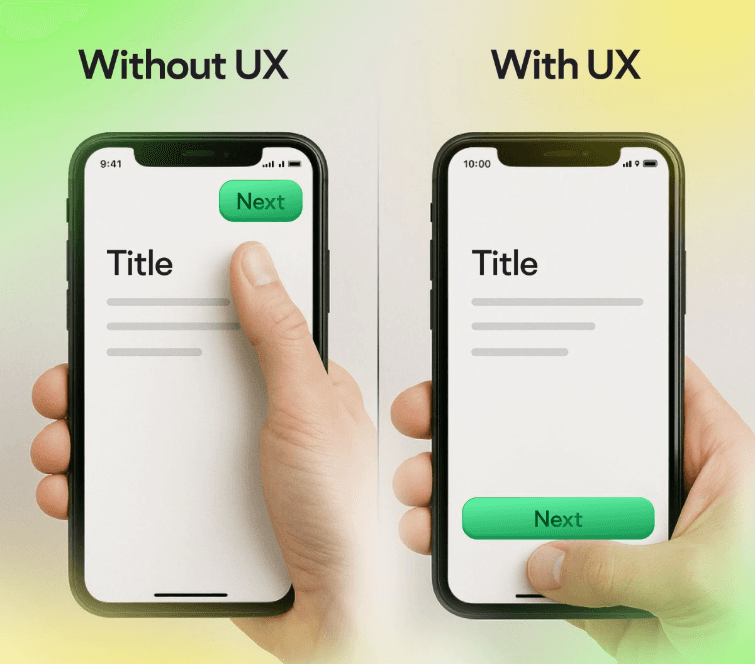
What Exactly is User Experience (UX) for WordPress Websites?
User experience refers to how people feel when interacting with your website. It’s the difference between a visitor thinking “This is exactly what I needed!” versus “Ugh, where’s the exit?”
UX goes beyond just how your site looks (that’s UI – user interface). It encompasses:
How easy it is to navigate your site
How quickly do pages load
Whether visitors can find information effortlessly
How your site works on mobile devices
The overall journey from landing page to conversion
Think of UX as your website’s hospitality. You want every visitor to feel welcomed, guided, and satisfied with their experience.
Why WordPress UX Matters More Than Ever
Your WordPress website isn’t just a digital brochure anymore – it’s your 24/7 sales representative, customer service agent, and brand ambassador rolled into one.
Here’s what happens when you improve website UX:
Bounce rates drop: Visitors stay longer and explore more pages
Conversions increase: Better UX leads to more sales, sign-ups, and inquiries
SEO improves: Google rewards user-friendly sites with higher rankings
Brand trust grows: Professional, smooth experiences build credibility
Poor UX, on the other hand, costs you money. Every confused visitor who leaves is a potential customer walking out the door.
Speed Up Your WordPress Website (Because Every Second Counts)
Website speed isn’t just a nice-to-have – it’s a UX fundamental. Research shows that even a one-second delay in page load time can reduce conversions by 7%.
Quick Wins for Faster Loading:
Optimize Your Images: Large, uncompressed images are speed killers. Use tools like Smush or ShortPixel to compress images without losing quality. Pro tip: Save images in WebP format when possible – they’re up to 25% smaller than JPEGs.
Choose a Quality Hosting Provider: Your hosting is like your website’s foundation. Cheap shared hosting might save money upfront, but slow loading times will cost you visitors. Consider managed WordPress hosts like WP Engine or SiteGround for better performance.
Use Caching Plugins: Caching stores a version of your pages so they load faster for returning visitors. Popular options include W3 Total Cache and WP Super Cache. Think of it as having your website’s most requested pages ready to serve instantly.
Clean Up Your Database: Over time, WordPress accumulates digital clutter – spam comments, old revisions, unused plugins. Use WP-Optimize to clean house and keep your site running smoothly.
Design for Mobile-First (Your Visitors Are on Their Phones)
Here’s a reality check: Over 60% of web traffic comes from mobile devices. If your WordPress site isn’t mobile-friendly, you’re essentially turning away more than half your potential audience.
Mobile UX Essentials:
Responsive Design: Your site should automatically adjust to any screen size. Most modern WordPress themes are responsive, but always test yours on different devices. Use Google’s Mobile-Friendly Test to check.
Thumb-Friendly Navigation: Make buttons and links large enough to tap easily. Apple recommends a minimum of 44px for touch targets – anything smaller frustrates mobile users.
Readable Text: Avoid tiny fonts that require zooming. Aim for at least 16px font size for body text on mobile devices.
Fast Mobile Loading: Mobile users are even less patient than desktop users. Compress images aggressively and consider using AMP (Accelerated Mobile Pages) for lightning-fast mobile loading.
Simplify Your Navigation (Make It Obvious Where to Go)
Your WordPress website isn’t just a digital brochure anymore – it’s your 24/7 sales representative, customer service agent, and brand ambassador rolled into one.
Your website navigation is like a roadmap. If visitors can’t figure out where to go, they’ll get lost and leave.
Navigation Best Practices:
Keep Menus Simple: Limit your main menu to 5-7 items maximum. Too many choices create decision paralysis. Group related pages under dropdown menus if needed.
Use Clear Labels: Skip creative menu names that sound clever but confuse visitors. “Services” is better than “What We Rock At.” Be descriptive and straightforward.
Add a Search Function: Sometimes, visitors know exactly what they want. A prominent search bar (especially for content-heavy sites) helps them find it quickly.
Include Breadcrumbs: Breadcrumbs show visitors where they are on your site. They’re especially helpful for e-commerce sites or blogs with lots of categories.
Improve Your WordPress Site’s Readability
Even the best content fails if it’s hard to read. Web users scan rather than read word-for-word, so format your content accordingly.
Readability Improvements:
Use Plenty of White Space: Cramped text overwhelms readers. Give your content room to breathe with adequate spacing between paragraphs and sections.
Break Up Long Paragraphs: Keep paragraphs to 2-3 sentences maximum. Long blocks of text intimidate readers on screens.
Choose Readable Fonts: Stick to web-safe fonts like Arial, Georgia, or modern options like Open Sans. Avoid decorative fonts for body text – save them for headlines only.
Create Visual Hierarchy: Use headings (H1, H2, H3) to organize content. Bold important points and use bullet lists to make information scannable.
Optimize Color Contrast: Ensure text is easily readable against background colors. Use tools like WebAIM’s contrast checker to verify accessibility.
Optimize Your Contact Forms and CTAs
Your contact forms and call-to-action buttons are where visitors become leads or customers. Make this process as smooth as possible.
Form Optimization Tips:
Keep Forms Short: Only ask for information you need. Each additional field reduces completion rates. Name and email might be enough for newsletter signups.
Use Clear Labels: Label form fields clearly and consider using placeholder text for examples. “Enter your email address” is clearer than just “Email.”
Provide Instant Feedback: Show success messages when forms are submitted and error messages when something goes wrong. Users need to know their action worked.
Make CTAs Stand Out: Use contrasting colors for buttons and action-oriented text like “Get Started” or “Download Now” instead of generic “Submit.”
Test and Monitor Your WordPress UX Improvements
Improving UX isn’t a one-time task – it’s an ongoing process. Regular testing helps you identify problems before they frustrate visitors.
Essential Testing Tools:
Google Analytics: Monitor bounce rates, page load times, and user behavior. High bounce rates on specific pages signal UX problems.
Hotjar or Crazy Egg: Heat mapping tools show where visitors click and how they navigate your site. This visual data reveals UX issues that you might otherwise miss.
User Testing: Ask real people to use your site while you observe. Their honest feedback often reveals blind spots in your design.
A/B Testing: Test different versions of pages to see what works better. Tools like Google Optimize let you experiment with headlines, buttons, and layouts.
Advanced UX Improvements for WordPress
Ready to take your WordPress UX to the next level? Consider these advanced strategies:
Personalization
Use plugins like OptinMonster to show different content based on visitor behavior or location. Personalized experiences feel more relevant and engaging.
Accessibility
Make your site usable for people with disabilities. Add alt text to images, ensure keyboard navigation works, and maintain good color contrast. It’s not just the right thing to do – it improves UX for everyone.
Website Security
Nothing destroys user trust like a “This site is not secure” warning. Use SSL certificates, keep WordPress updated, and consider security plugins like Wordfence.
Load Testing
Use tools like GTmetrix or Pingdom to test your site speed regularly. Set up monitoring alerts so you know immediately if performance drops.
Common WordPress UX Mistakes to Avoid
Learning from others’ mistakes saves time and frustration. Here are UX pitfalls to steer clear of:
Auto-playing videos or music: Let users choose to play media
Pop-ups that appear instantly: Give visitors time to see your content first
Broken links: Regularly check for and fix 404 errors
Outdated content: Keep information current and remove old, irrelevant posts
Too many plugins: Each plugin can slow down your site – only keep what you use
Your Next Steps to Better WordPress UX
Improving your WordPress website’s user experience doesn’t happen overnight, but every small change adds up to a better overall experience for your visitors.
Start with the basics: speed up your site, ensure mobile-friendliness, and simplify your navigation. Then, gradually implement more advanced improvements based on user feedback and testing data.
Remember, great UX is about understanding your visitors’ needs and removing obstacles between them and their goals. When you make their journey smoother, they’re more likely to stick around, engage with your content, and ultimately become customers.
Ready to transform your WordPress site into a user experience powerhouse? Start with one improvement today – your visitors (and your conversion rates) will thank you for it.
What aspect of your WordPress UX needs the most attention right now? Focus there first, and you’ll see immediate improvements in how users interact with your site.